10 Elements of Good Data Visualization
Data visualization is becoming more and more critical in this age of information overload, where cutting through the noise to communicate valuable messages is a real challenge.
Nobody wants to wade through complex reports or detailed explanations to get the information they need to take action or make a decision. A graphical or pictorial representation, however, can provide the same information efficiently and attractively, leading to much better results – for you and your audience.
Here are 10 elements of good data visualization that can help you present information that readers can process quickly and easily.
-
Clear Headings and Keys
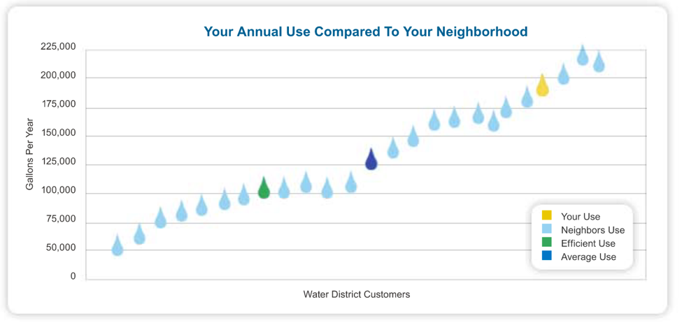 One of the easiest, clearest ways to communicate a message with data visualization is to through headings and keys. The more compelling the heading, the more attention the reader will pay to the data in the chart or graph. To create the most compelling heading possible, you’ve got to understand your audience. For example, don’t use technical terms or jargon to communicate to the general public. And it doesn’t hurt to get as personal as possible – like the graph above. Using the word “your” makes the data immediately relevant to the reader. When it comes to keys, keep them as clear and simple as possible. Short labels and drastic color variance make them easy to use at a glance, and placing them in the right location – where they’re clearly visible but don’t block any data – helps avoid confusion.
 -
Obvious Trends
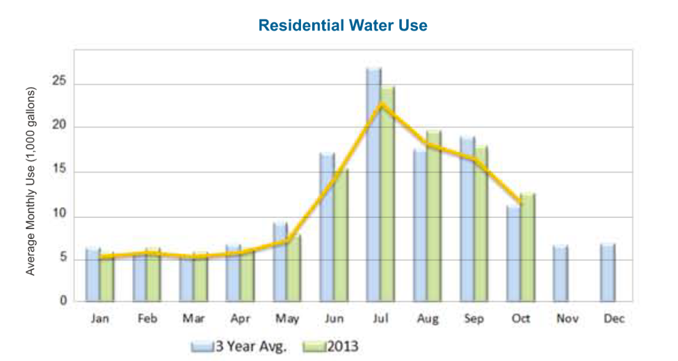 One of the main benefits of data visualization is its usefulness in showing trends. It can take a lot of time and effort poring through reports to spot a trend, but a chart or graph can make one obvious in an instant. So, if you have a trend, point it out. Lay out all the data you have and use lines to “connect the dots” like this graph does. The reader can get specific information from the bar graph while immediately picking up on the trend that the line depicts.
 -
Simple Analysis
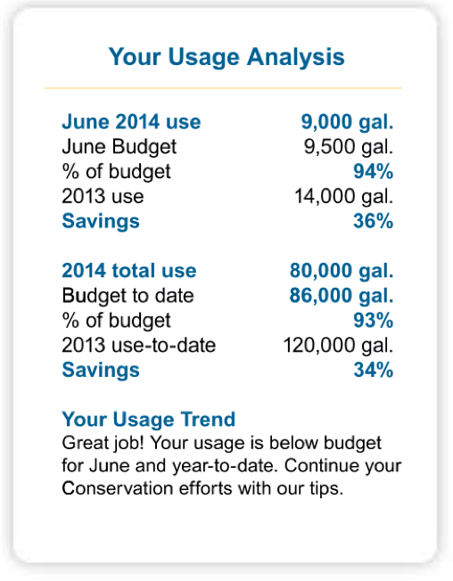 Not all data visualization has to come in the form of charts and graphs. Sometimes, just a simple, well-organized table will do the trick. In fact, clearly breaking down valuable analyses like this saves the reader work because they don’t have to interpret the data themselves. You can do the math for them to make the takeaways as obvious and inarguable as possible. Keep the information simple and brief, and use bold and/or colored font for key points. You can even add a short summary sentence or two to emphasize the overall message.
 -
Relevant Comparisons
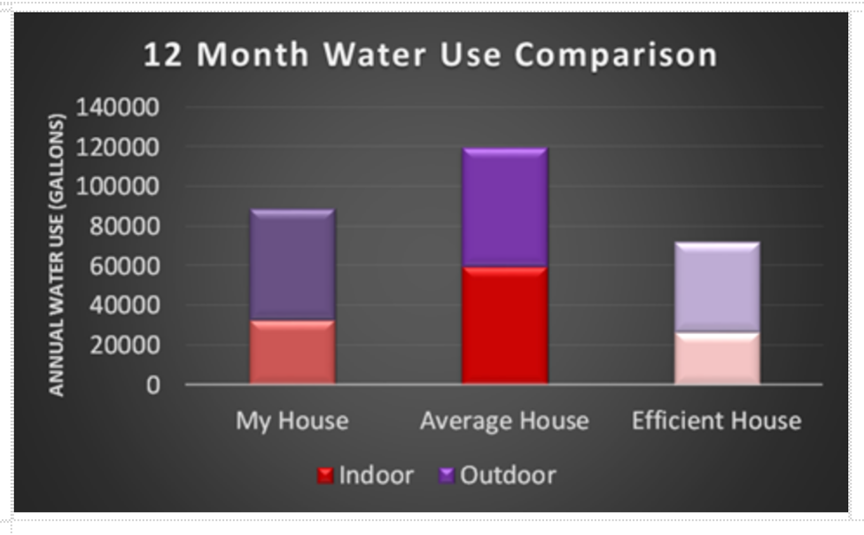 Comparisons can be a very effective data visualization tool, whether you’re trying to drive home a point or encourage a particular behavior in readers. Comparisons help put your data into context. This works best when you’ve got various sets of data that are directly comparable. Displaying current data alongside averages and standards, for example, shows the reader not only how things are, but how they could or should be.And the more detail you can provide within the comparison, the better. This helps the reader understand the “why” and/or “how” of the message you’re trying to send – it makes your data actionable. The graph above, for example, lets the reader easily see that reducing their outdoor water usage would help them meet the standard for a water-efficient household.
 -
Lots of Data/Evidence
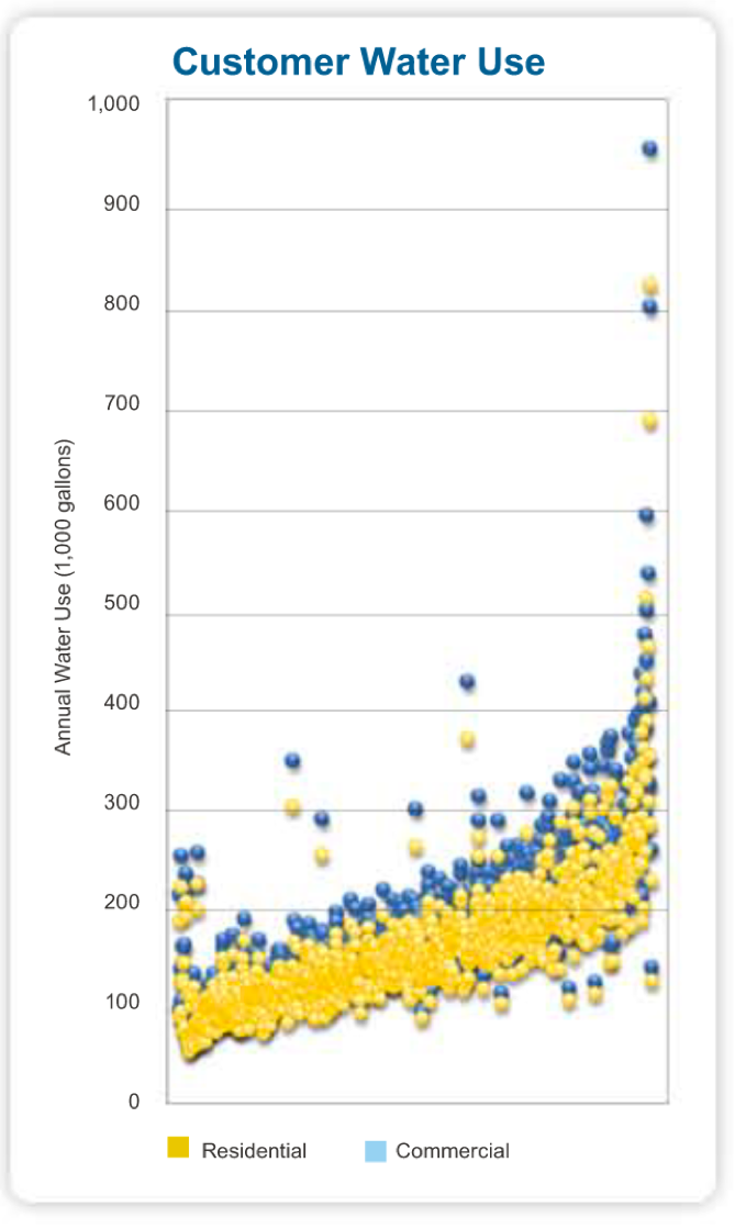
The more points – essentially, evidence – you represent in a data visualization, the more compelling the overall picture can become. Trends look more established, and outliers look more exceptional. That said, take care to present the data clearly. Don’t sacrifice a straightforward message simply to display an impressive amount of data. The scatterplot above works because its data points come together to display a trend. -
Summaries of Key Points
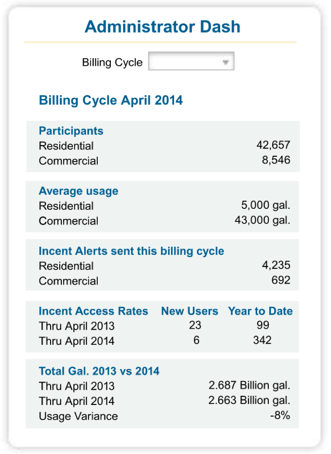 In certain situations, data visualization in the traditional sense (with colorful graphics) is not the most effective way to display information. You need something shorter and clearer than detailed reports, but charts and graphs would be overkill. The solution: a simple table. You don’t have to analyze or calculate or point out a trend, you just have to present the most important points as efficiently as possible. With clear headings and minimal rows and columns, your reader has all the information they need at a glance.
 -
Add design elements
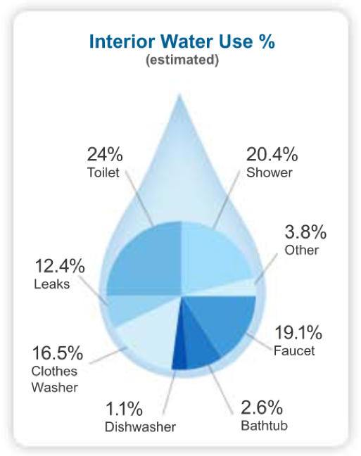 Adding design elements to data visualization can help enhance your message in subtle but important ways. It can not only help catch readers’ eyes and spark interest, but also add to the professional look and feel of the presentation. Design can also bring visual cues that add relevance for the reader. The water drop above helps communicate the chart’s topic and importance in an understated, attractive way.
 -
Consolidated Information
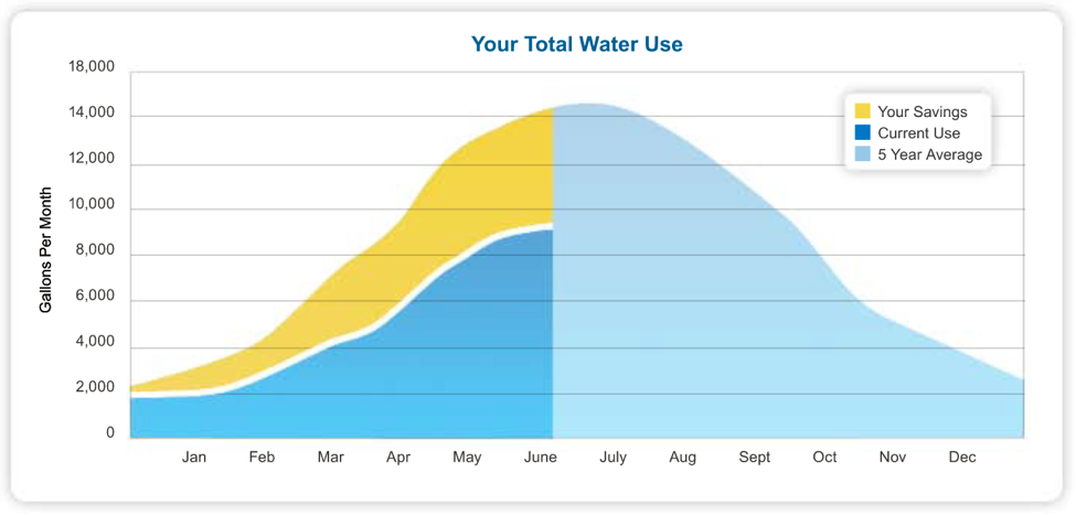 Another great thing about data visualization is that it can convey several ideas at once in an easily understandable way. Visually representing individual data points helps convey detailed information and a bigger picture simultaneously. This chart, for example, concisely illustrates at least three important pieces of information:
- Current water usage
- Water savings as compared to an average
- The line to stay below to continue saving in future months
-
Widely Understood Structure
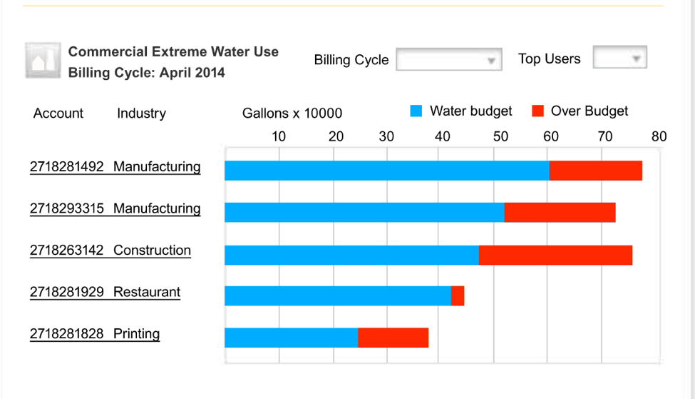
If it seems like lots of data visualization uses the same common forms and structure – bar graphs, pie charts, line graphs, and the like – there’s a good reason. These kinds of format are both efficient and widely understood. And when the point is to communicate quickly and clearly in a way that any reader can pick up on, it helps to make familiarity work in your favor. The piece above not only uses a common format (bar graph) that just about everyone has seen and understands, but also common color cues. Red signals “over budget” in lots of use cases and most people quickly recognize it as such. -
Comparisons to Averages
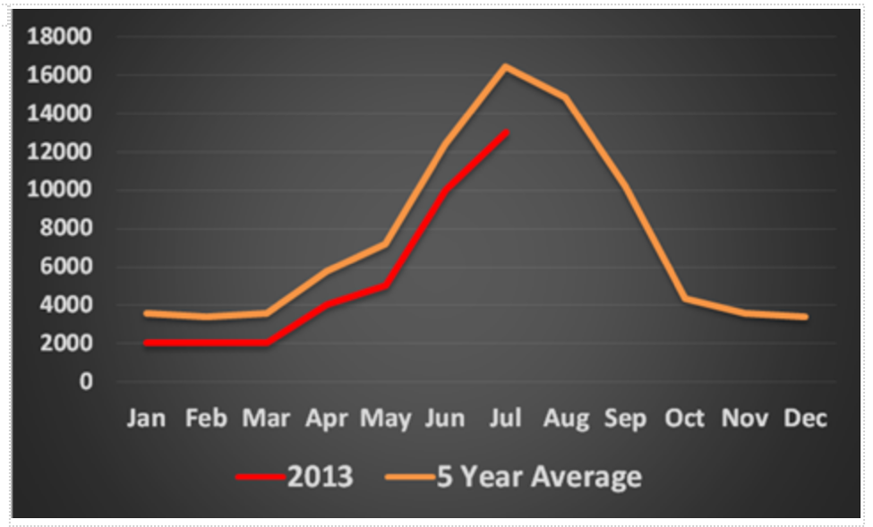
Averages can be a handy point to add to just about any data visualization. They are relatively easy to calculate, and they are hugely helpful in putting data into context. Knowing the data is one thing, but seeing it in comparison to an average and knowing whether it’s trending higher or lower or better or worse is a lot more informative.